Monday, June 27, 2011

Chanel Illusions d'Ombre Graphite Le Vernis and Comparisons

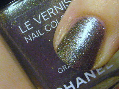
We first got a sneak peek at Graphite many months ago with a brief picture from a Chanel show. Now, finally, the color is our and in the public's hands, so to speak.

Flash

Of the three new Chanel polishes, this is the only one that is not frosty. This one has a distinct foil finish. It may look like a glittery gray, but it's actually very multi-dimensional. This leans more to the cool side, rather than a completely neutral gray.

No Flash

The amount of glittery flecks in this are outstanding. It dries a little bit bumpy, but nothing that a good topcoat won't fix. My skin tends to be on the warm side, but I still like how this looks on my hands. I will definitely be wearing it often.


I have lots of foil grays in my stash. But I grabbed a few recent higher-end releases. Not that long ago, for the Spring of 2011, Chanel released another gray color - Black Pearl. I grabbed that one as well as Dior's Tzarina Gold from their Holiday 2010 collection. It's brown, not grey, bit it also has the multi-dimensional foil.

L-R: Black Pearl, Graphite, Tzarina Gold


Black Pearl was a very different finish, frosty with some minor brushstrokes, but it also has a distinct gunmetal green hue, quite different from Graphite. Tzarina Gold, as mentioned, has the same finish, but with a distinct brown color. I do love all three.

Graphite will earn a permanent place in my stash.

Saturday, June 25, 2011

Chanel Illusions d'Ombre Quartz Le Vernis and Comparisons

Next up, Chanel Quartz. This color is a beige-silver frost. I know, frost sounds a little 1980's, but it's not too bad. I have heard that this is close to Illamasqua's Bacterium, however I don't own this one, so I can't compare. Although I will do some comparisons at the end of the post.


This one left more brushstrokes than did Peridot. I make no bones about my Chanel love, but I'm not in love with this color. I like it, however it looks a little bit off on my hands. Couple that with the pretty obvious brushstrokes, and I'm not sure just how much I will be wearing this one.


In going through my stash, I pulled a couple of colors that I thought could be close. I came up with two:

L-R: Believe, Timeless Gold, Believe


I grabbed Deborah Lippmann Believe and Dior Timeless Gold. Believe is obviously lighter, however it shows up a little darker once it dries on the nail. Timeless Gold had a similar color, with a bit more warm gold in it, where Quartz is a bit more taupey-beige.


Another big difference in the colors - where Quartz dries as a frost, with obvious brushstrokes, Timeless Gold and Believe dry as a foil, no brushstrokes anywhere in sight. I actually prefer Timeless Gold over Quartz.

It's a nice color, but not on my hands. Don't worry, it's staying firmly put in my stash and I will wear it a few times, but it's not up there with my favorites.

Friday, June 24, 2011

Chanel Illusions d'Ombre Peridot Le Vernis

First up in my trio de Chanel is Peridot. Of the three, this one is my favorite, and one that I will see wearing over and over, despite the brushstrokes. Let me apologize for the following images, the duocrome of this added with the metallic finish was playing tricks with my camera.

With Flash

If you're looking for a green polish, keep on going. Yes, this polish does flash green in some lights, but it is a deep warm gold on the nails. What you do see, which I tried to capture on film, is a great green halo around the nail.

No flash, and a wee bit of color correction

Formula was typical Chanel, small brush, great formula, unique color. I couldn't find any comparisons in my stash. However, as I've mentioned before, you do see brushstrokes. That wasn't enough to deter me from wearing it.


You will see flashes of green as  you move your fingers around and play with the light. But you will mostly see gold.


I adore this color.

Wednesday, June 22, 2011

Chanel Illusions d'Ombre Fall 2011 Nail Polish Sneak Peak

While working from home today, I sat in full view of my front door, stalking the UPS guy. Finally, at 5:30, this shows up on my doorstep


Oh, my! Whatever could it be??

Here's a hint:


Why yes, the three Fall 2011 (Fall? Fall?? It's not even July for goodness sakes!) Chanel Illusions d'Ombre Nail Lacquers. The second I saw a picture of these colors online, I knew I had to have them. Once I heard they were for sale on the Chanel website, I had them ordered before you could say "debit card".


Chanel is releasing 3 new colors for the fall. Graphite - a glittery charcoal gray. Peridot, a greenish-gold duochrome frost and Quartz, a beige metallic frost. Yes, I said frost. Peridot and Quartz definitely have a frosty finish to them, which means brushstrokes galore if you are not careful. But you know what? I don't care. I love these colors.

I took tons of pictures of these three, but the metallic finishes were wreaking havoc on my wimpy old point and shoot. I'll post my pics and thoughts on the colors over the next three days. I wanted to split up the posts because of all the pictures - I even grabbed some comparisons of Graphite and Quartz.

Ahh, Chanel.

Sunday, June 19, 2011

Revlon Just Tinted - Victorian

Sometimes this blog makes me do odd things. Like buy things that I know I won't like simply to take pictures of them and share them. Take Revlon's new Just Tinted line. I don't like overly sheer polishes. I do like the occasional jelly, as long as I can build it up to a nice squishy opacity in 4 coats or less - and even 4 is pushing it. Yet, I buy this polish, albeit a very lovely color, where 3 coats forms a very, very visible nail line.

So, I think, let's try it with different base and top coats! yeah!

The color is nice. Victorian is a bright, slightly peachy pink. The polish is very watery, but it actually stays where you put it.  For the pictures I used Orly Bonder on my pointer and middle finger, and Orly ridge filler on my ring and pinky finger. I thought the ridge filler would add a bit of a colored base so that the VNL wouldn't be so visible. Then, because it dries to a semi-matte, I used a shiny topcoat on the pointer and ring finger.

Please ignore the lovely dent in the pinky, I rushed the picture.

As you can see, the nail lines are very visible. The ridge filler helps only a slightly.

Just for the heck of it, I used an opaque white nail polish as a base on my thumb. The completely eliminated the VNL, but, as least for me, made the edges hard to cover.


In the end, I won't buy the other colors in the collection, and I'll probably shove this one into the back of my drawer and forget about it for a few years.

Saturday, June 18, 2011

I am officially done with the shatters - OPI blue shatter

I've given in, I'm caving, calling uncle. I'm done with the shatters. I still like black, and will still put it on at then end of the manicure lifespan, but I am not buying anymore.


When the blue shatters appeared in my local Ulta recently, I grabbed Blue Shatter (I wanted Navy, but it was sold out). As my Bikini Bottom sandwich manicure was beginning to chip, I applied the shatter coat. I'm getting good at applying the shatter coats so that they shatter nicely. However, I don't think there was enough contrast here to look interesting.


I also don't really enjoy the shimmery shatter. I like the creme shatters. I know the Navy shatter is a jelly, but honestly, I've over it already. If you like shimmery blue shatters - go for it. I have a feeling this trend may be coming to a close soon.

Now, the upcoming Chanel Fall lacquers? Oh Good God, I don't know if I can wait. My debit card is already getting the itchy feeling.

Hello, unplanned blog break!

Cold + work issues + Spitfire's birthday = unintentional blogging break.

I'm back, and I have a couple of things planned!

Monday, June 6, 2011

Rescue Beauty Lounge Bikini Bottom Sandwich

So, there are posts about nail color sandwiches are all over the interwebs. You take a jelly polish, apply a couple of coats, layer a glitter coat, followed by one more jelly coat. So, I decided to try it out.


I recently scooped up a bottle of Rescue Beauty Lounge Bikini Bottom after the first Bring it Back vote. I have to admit - I love SpongeBob SquarePants. The spitfire is a big fan, so it is playing often in this house. For those who don't have children - Bikini Bottom is the town under the sea where SpongeBob lives. This is a lovely robin's egg blue jelly.


The polish itself was absolutely lovely. Yes, it's a jelly, so there's a distinct visible nail line (VNL) after a few coats. I used a ridge filler as a base coat, so that helped a bit with the opacity. The formula was nice - not too thin and watery for a jelly. It went exactly where I placed it. After two coats, I used a coat of Revlon Galaxy, which is mostly small square glitter with a few larger hexagons suspended in a clear base. The glitter looks better in the bottle than on the nail. I would like a few more hex glitters on the nail, but they were hard to control on the nail. I finished up with another coat of Bikini Bottom and a nice coat of Seche Vite.


People describe jellies as "squishy". I have to agree. It is squishy and shiny and fun. I love this color, but next time I will use it all on its own and nix the glitter.

Friday, June 3, 2011

Why did I wait so long? Color Club Revvvolution

My love for holos is not undocumented. However, of all the holos that I have, they are predominantly pastels. Now, I am not a pastel person. I would love a deep royal blue holo (and not to pay exorbitant prices on eBay for OPI DS Glamour) or an emerald green holo. A deep charcoal holo is also nice, but OPI My Private Jet - the non-dud version - is also selling for stupid expensive prices on eBay.


So, enter Color Club Revvvolution. The only place I can get this brand near me is at Bed Bath and Beyond, and the one closest to me has been out of stock for months. So the other day I was in a different BB&B and finally saw Revvvolution and it looked like a complete dud - I couldn't detect a holo, just silver-ish glitter. I thought, "Oh, what the hell" and threw it in my basket. Once I paid and took it out in the sunshine - I realized that the sun brings out the subtle holo. All was right with the world again.


Of course I came home and immediately put it on. For a $3.50 bottle of nail polish, the application was pretty nice. It was almost fully opaque in one coat. I put on a second just to even it out. The holo isn't as pronounced as others, but in direct light (sunlight or artificial light) it does produce a nice holo.


I'm glad I took the chance on this one, and wondered why I waited so long!
Related Posts Plugin for WordPress, Blogger...